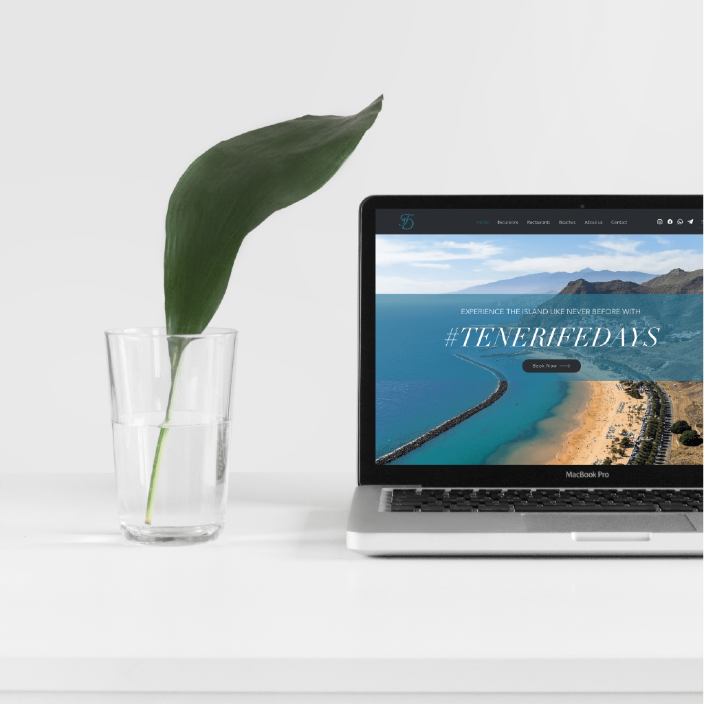
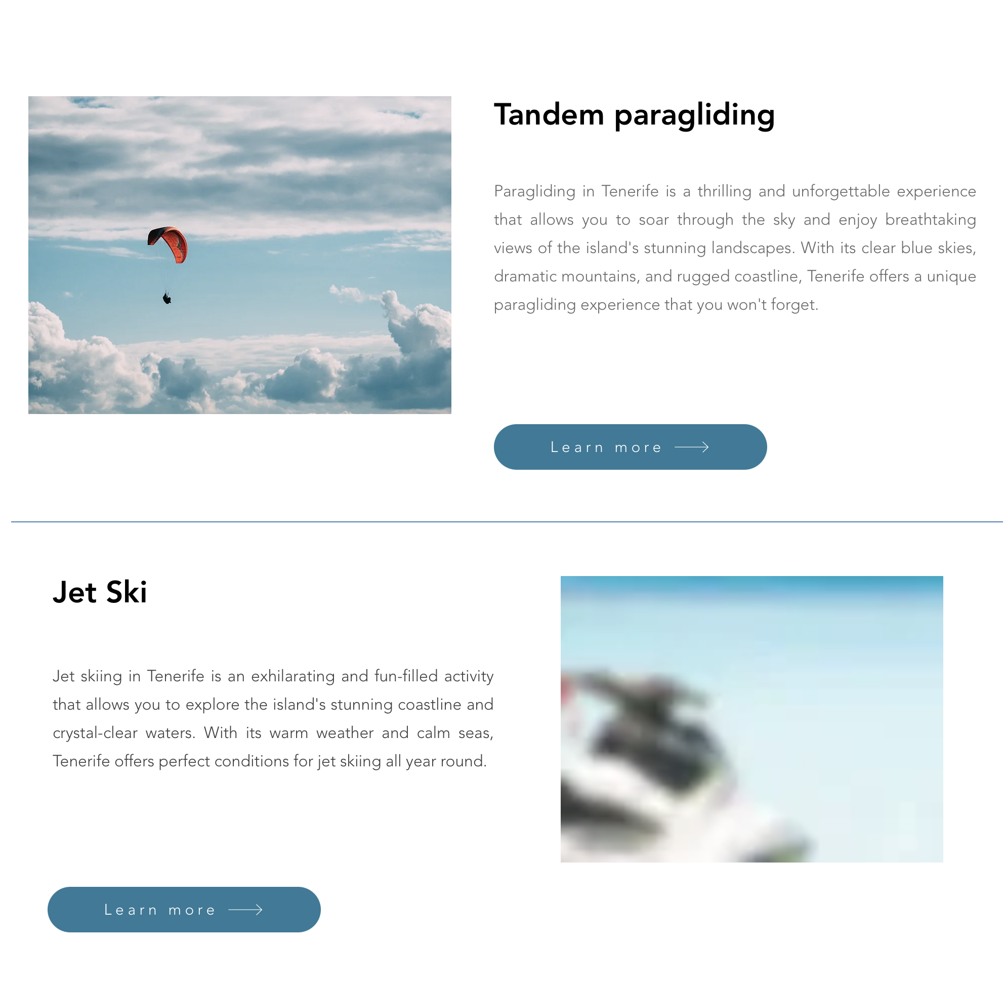
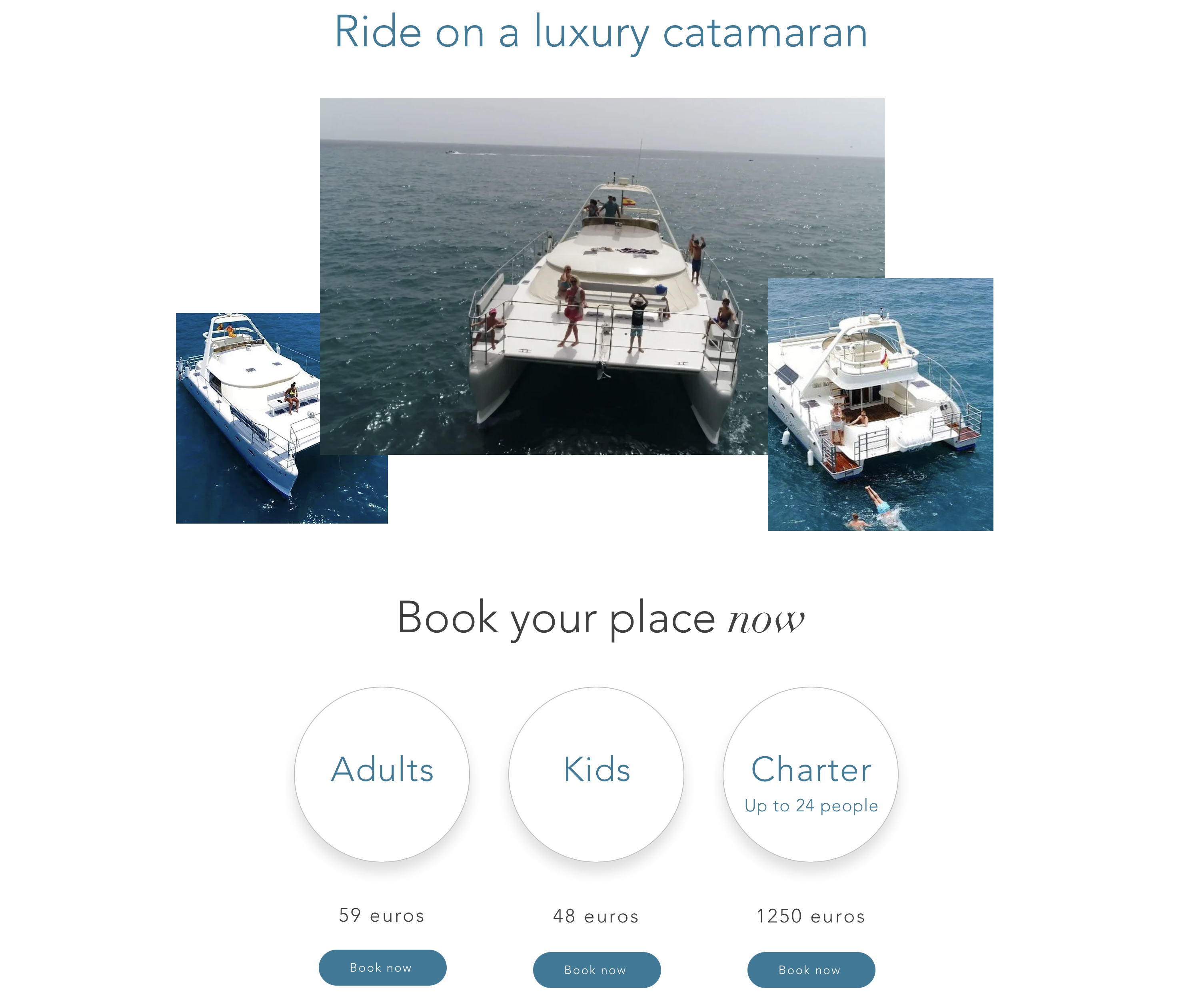
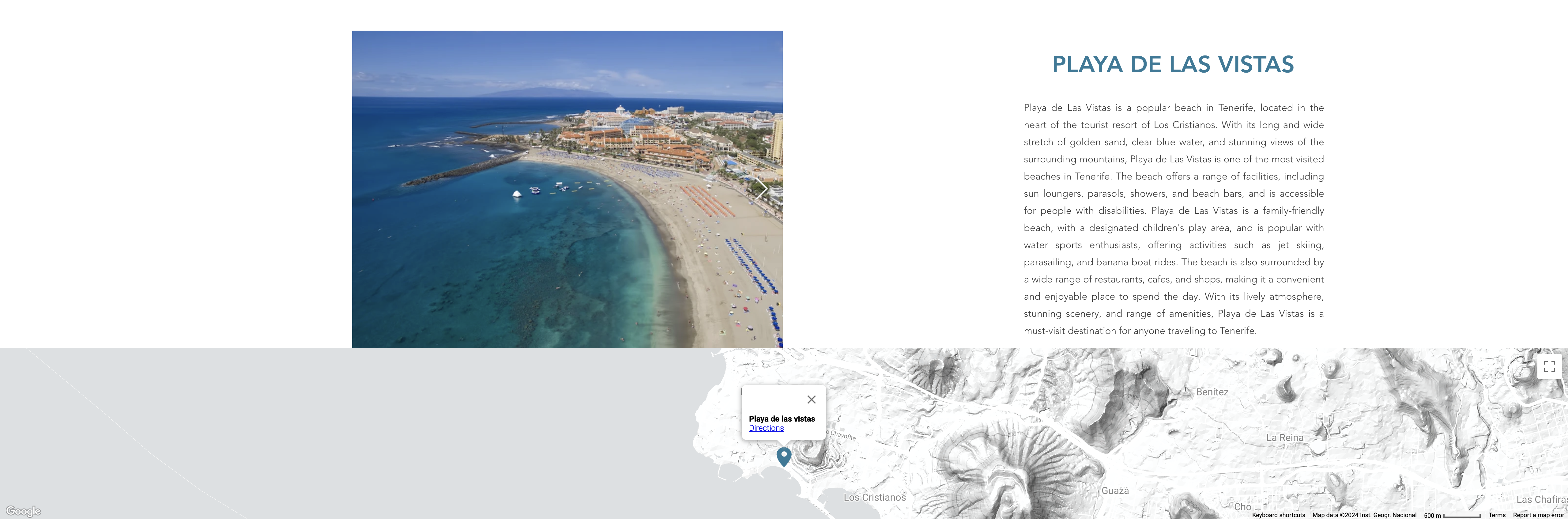
The Tenerife Days website was designed with a focus on the user experience (UX/UI), The site is designed to ensure that visitors can navigate intuitively and explore the different experiences the company has to offer. On the website, users can book various excursions, as well as rent cars and motorcycles, The hotel is located on the island, facilitating access to a variety of activities and services available on the island.
The design is clean and attractive, using high quality images that showcase the beauty of Tenerife and the activities available, from excursions to natural landscapes to vehicle adventures. The website includes dedicated sections for each type of experience, testimonials from satisfied customers and an easy-to-use booking system. In addition, the site is fully optimized for SEO, This facilitates its visibility in search engines and helps attract more visitors interested in exploring the island.