
Barcelona, Spain
Monday to Friday
from 09:00 to 18:00 CET
24 working hours.
Full proposal in 48.
Branding and digital architecture studio in Barcelona
Health and wellbeing, Barcelona
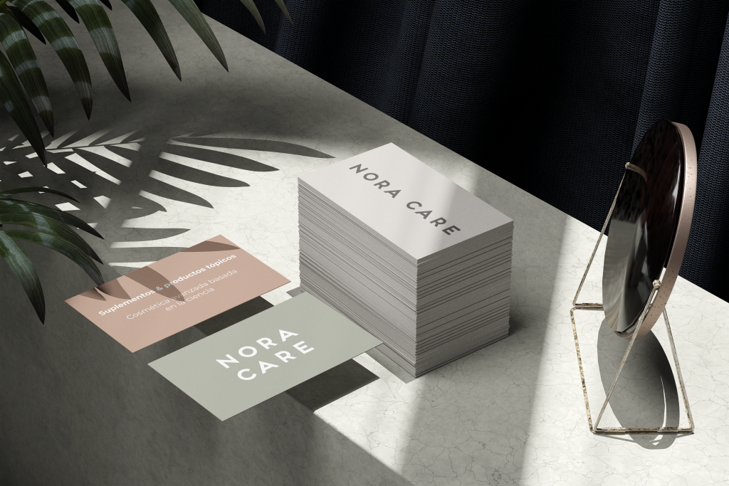
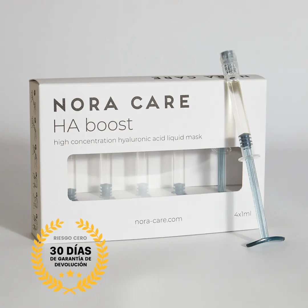
Visual identity, website and packaging for a personal care brand.
The challenge
Personal care is saturated with interchangeable brands: thin typography, pastel tones and the exact same wellness rhetoric.
Nora Care needed to differentiate itself without sacrificing the calm promised by the product, and to do so on a budget that did not allow for large-scale photographic productions.
What we did
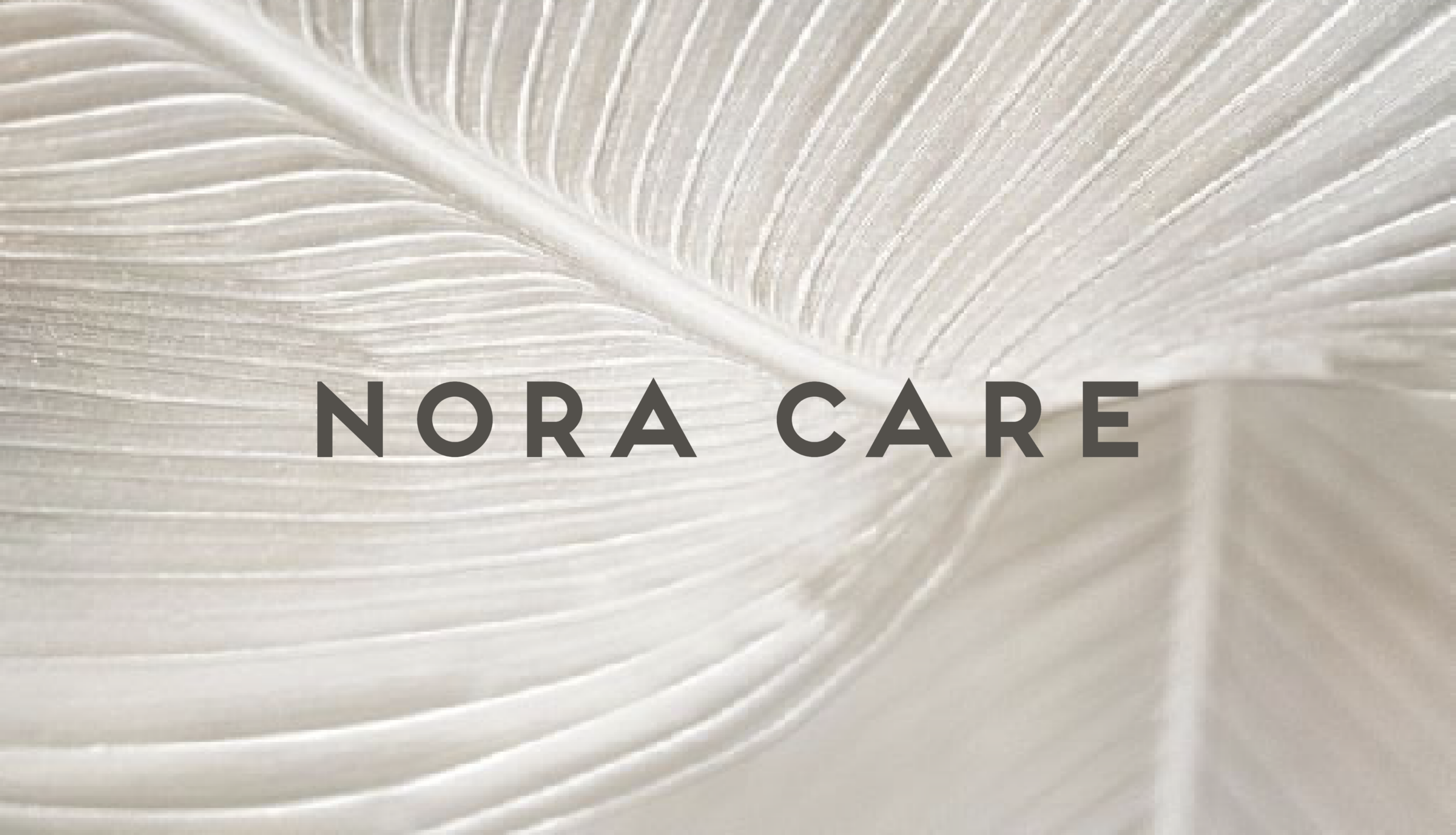
We built a restrained identity supported by whitespace and a limited palette, so that the product stands out without competing with the packaging.
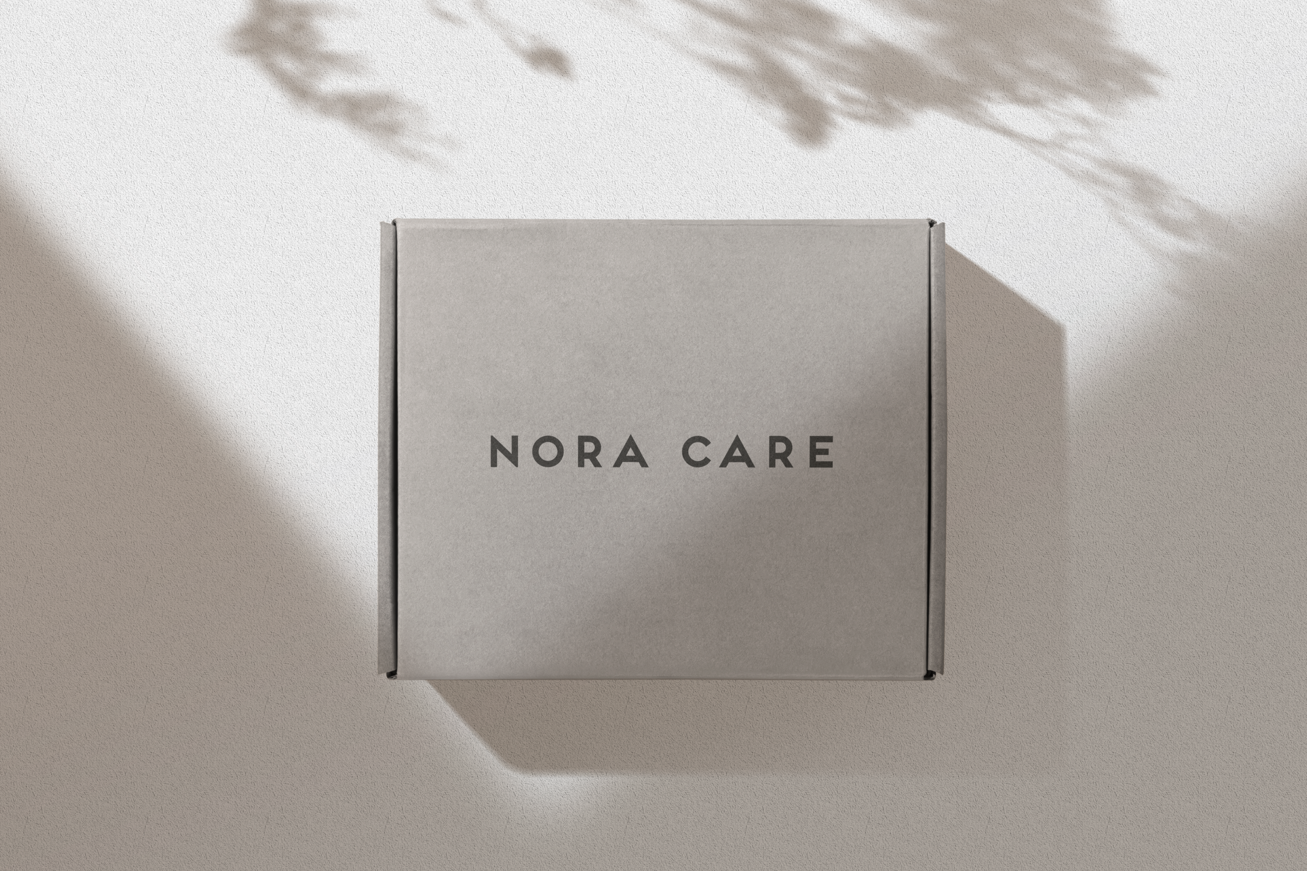
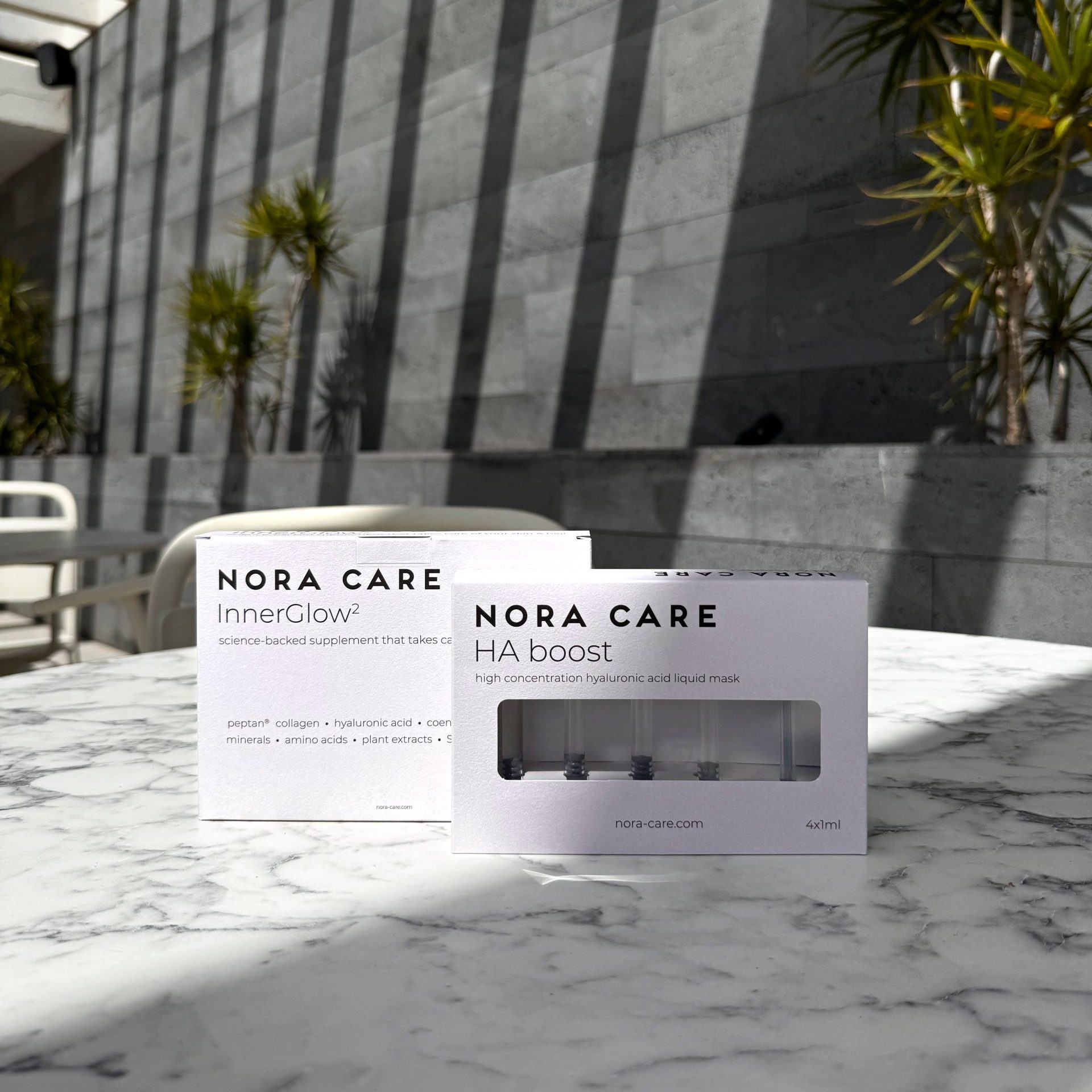
We design the packaging with the unboxing moment in mind, which is where a personal care brand is won or lost.
We developed the site with the product page as the centerpiece, explaining usage and composition without the usual industry waffle.
The result
The brand gained a physical presence consistent with what it promised digitally, uncommon in projects of this size.
Adding new references doesn't require redesigning anything, just applying the existing grid.
Let's talk
Tell us. Full proposal within 48 hours, with fixed scope, timeline and price.
Boutique branding and digital architecture studio.
Barcelona, Spain.